
What is Overflow in CSS?
In this blog post, we will dive into the world of web development and explore a fundamental concept in CSS (Cascading Style Sheets) called "overflow." We will start from the basics, so even if you are a beginner in programming, you can follow along. We will also provide code examples to help you understand the concept better.
Table of Contents
- Introduction to CSS
- Understanding the Box Model
- What is Overflow?
- How to Control Overflow
- Visible (default behavior)
- Hidden
- Scroll
- Auto
- Practical Examples of Overflow
- Conclusion
Introduction to CSS
CSS, or Cascading Style Sheets, is a language used to define the look and formatting of a document written in HTML (Hypertext Markup Language) or XHTML (eXtensible Hypertext Markup Language). It is used to style web pages and manage the layout, color, font, and other visual aspects.
In simple terms, think of HTML as the skeleton of a web page, while CSS is the skin and clothes that make it look beautiful.
Understanding the Box Model
Before we dive into the concept of overflow, let's discuss the Box Model. In CSS, every element on a web page is represented as a rectangular box. This box consists of four parts:
- Content: This is the actual text, images, or other media inside the element.
- Padding: This is the space between the content and the border of the element.
- Border: This is the line that surrounds the padding and content.
- Margin: This is the space between the border and the neighboring elements.
The sum of the content, padding, border, and margin widths make up the total width of the element. The same goes for the height of the element.
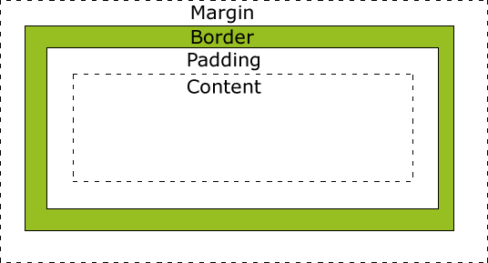
Image source: W3Schools
What is Overflow?
Now that we understand the Box Model, let's talk about overflow. Overflow occurs when the content of an element exceeds the size of its box. In other words, the content becomes too big to fit inside its container.
Imagine you have a small box, and you try to stuff a lot of items into it. Eventually, the items will start spilling out of the box. This is similar to overflow in CSS.

Image source: W3Schools
How to Control Overflow
Luckily, CSS provides us with a property called overflow that allows us to control how the excess content should be displayed. There are four values we can use for the overflow property:
visible(default behavior)hiddenscrollauto
Let's go through each of these values and see how they affect the overflowing content.
Visible (default behavior)
By default, the overflow property is set to visible, which means that the content will be displayed outside of the box if it overflows.
.box {
    width: 150px;
    height: 150px;
    border: 2px solid black;
    overflow: visible;
}
In the above example, if the content inside the .box element is larger than 150x150 pixels, it will spill out of the box.
Hidden
When the overflow property is set to hidden, the excess content will be clipped, and the parts that don't fit inside the box will not be visible.
.box {
    width: 150px;
    height: 150px;
    border: 2px solid black;
    overflow: hidden;
}
In this example, the content that doesn't fit inside the .box element will be hidden from view.
Scroll
Setting the overflow property to scroll adds a scrollbar to the element, allowing the user to scroll through the overflowing content.
.box {
    width: 150px;
    height: 150px;
    border: 2px solid black;
    overflow: scroll;
}
Now, if the content inside the .box element overflows, the user can use the scrollbar to view the entire content.
Auto
The auto value for the overflow property will only add a scrollbar if the content overflows the box.
.box {
    width: 150px;
    height: 150px;
    border: 2px solid black;
    overflow: auto;
}
In this example, the scrollbar will only appear when the content inside the .box element is larger than 150x150 pixels.
Practical Examples of Overflow
Now that we understand the different values for the overflow property, let's look at some practical examples.
Example 1: Image Gallery
Imagine you want to create a simple image gallery with a fixed height and width. If there are too many images to fit inside the gallery, you want the user to be able to scroll through them.
<div class="image-gallery">
    <img src="image1.jpg" alt="Image 1">
    <img src="image2.jpg" alt="Image 2">
    <img src="image3.jpg" alt="Image 3">
    <!-- more images -->
</div>
.image-gallery {
    width: 300px;
    height: 200px;
    border: 2px solid black;
    overflow: auto;
}
In this example, the image-gallery container will only show a scrollbar when the images inside it exceed the 300x200 pixel size.
Example 2: Text Block with Scrollbar
Suppose you want to display a large block of text in a small container with a fixed height, and you want the user to be able to scroll through the content.
<div class="text-block">
    <p>Lorem ipsum dolor sit amet, consectetur adipiscing elit...</p>
    <!-- more text -->
</div>
.text-block {
    width: 200px;
    height: 100px;
    border: 2px solid black;
    padding: 10px;
    overflow: auto;
}
In this example, the text-block container will only show a scrollbar when the text inside it exceeds the 200x100 pixel size.
Conclusion
In this blog post, we have explored the concept of overflow in CSS and how it relates to the Box Model. We have also learned about the four different values for the overflow property: visible, hidden, scroll, and auto, and how they affect the display of overflowing content.
Understanding and controlling overflow is an essential skill for web developers, as it helps create a better user experience and ensures that content is accessible and easy to navigate.