
What is the Anatomy of CSS?
CSS, or Cascading Style Sheets, is a powerful language used for designing the look and feel of web pages. It acts as the skin of a website, providing a consistent appearance across different elements and pages. In this blog post, we'll take a deep dive into the anatomy of CSS, exploring its various components and how they work together.
What is CSS?
CSS is a styling language used to describe the appearance of HTML elements on a web page. It allows you to control aspects such as typography, colors, layouts, and more. CSS can be written both internally (within an HTML file) and externally (in a separate .css file) and is applied to HTML elements through a set of rules called selectors.
The Basics: Selectors, Properties, and Values
The core components of CSS are selectors, properties, and values. Let's break down each component:
Selectors
Selectors are used to target specific HTML elements on a web page. They come in various types, including:
- Tag selectors: Targets elements based on their HTML tag, e.g.,
h1,p,a. - Class selectors: Targets elements based on their
classattribute, e.g.,.button,.nav-item. - ID selectors: Targets elements based on their
idattribute, e.g.,#header,#footer.
/* Tag selector */
h1 {
  font-size: 24px;
}

/* Class selector */
.button {
  background-color: blue;
}

/* ID selector */
#header {
  background-color: red;
}
Properties
Properties define the specific aspect of an element that you want to style. There are numerous properties available in CSS, covering aspects such as font, color, spacing, layout, and more. Some common properties include:
color: Sets the text color of an element.font-size: Sets the font size of an element.background-color: Sets the background color of an element.margin: Sets the spacing outside an element.padding: Sets the spacing inside an element.
Values
Values are assigned to properties to determine the specific styling applied to an element. Values can be expressed in various units, such as:
- Absolute units: Fixed units like pixels (
px), points (pt), or inches (in). - Relative units: Units that are relative to other values, such as percentages (
%), ems (em), or viewport units (vw,vh). - Keywords: Predefined values, like
auto,inherit, orinitial.
h1 {
  font-size: 24px; /* Absolute unit */
  color: blue; /* Keyword */
  margin-bottom: 1em; /* Relative unit */
}
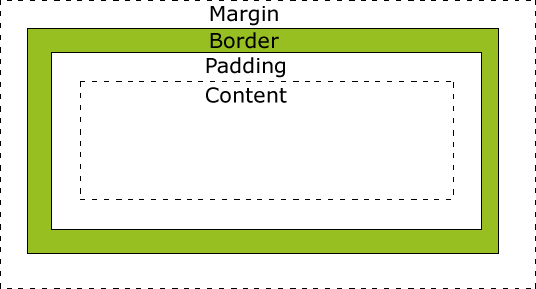
The Box Model
The CSS box model is a fundamental concept that describes the rectangular boxes generated for elements. Each box consists of four parts: content, padding, border, and margin.
- Content: The actual content of the element, such as text or images.
- Padding: The space between the content and the border, which affects the size of the element.
- Border: The line surrounding the content and padding, which can have varying thickness and style.
- Margin: The space outside the border, which affects the distance between elements.
Here's an example of how the box model can be styled using CSS:
.box {
  width: 200px;
  height: 100px;
  padding: 20px;
  border: 2px solid black;
  margin: 10px;
}
The Cascade
The "cascade" in Cascading Style Sheets refers to how styles are applied to elements based on their specificity and order of appearance. When multiple styles are applied to the same element, CSS follows a set of rules to determine which styles take precedence.
- Importance: Styles marked with
!importantwill always take precedence, regardless of specificity or order. - Specificity: More specific selectors take precedence over less specific ones. Specificity is calculated based on the number of ID, class, and tag selectors in a rule.
- Order: The last defined style will take precedence when importance and specificity are equal.
/* The background color will be red, as it has a higher specificity */
#header {
  background-color: blue;
}

header {
  background-color: red !important;
}
Responsive Design and Media Queries
Responsive design is the practice of designing websites that adapt to different screen sizes and devices. CSS plays a crucial role in responsive design through the use of media queries, which allow you to apply styles conditionally based on the properties of the user's device.
A media query consists of a media type (e.g., screen, print) and one or more expressions that evaluate to true or false. When the media query's conditions are met, the enclosed styles are applied.
/* Apply styles for screens smaller than 600px */
@media screen and (max-width: 600px) {
  .container {
    width: 100%;
  }
}
Inheritance
Inheritance is a feature of CSS that allows some properties to be inherited from a parent element to its children. This helps maintain consistency and reduces the need to define the same styles repeatedly.
For example, if you set the font-family property on a parent element, all its children will inherit the same font family, unless specifically overridden.
body {
  font-family: Arial, sans-serif;
}

/* The font-family property will be inherited by the h1 element */
h1 {
  font-size: 24px;
}
Conclusion
CSS is an essential tool for any web developer, allowing you to create visually appealing and responsive websites. By understanding the basic anatomy of CSS, including selectors, properties, values, the box model, cascade, responsive design, and inheritance, you'll be well-equipped to create stunning web designs that are both functional and aesthetically pleasing.